* BEST SKI GRAPHICS AWARD:
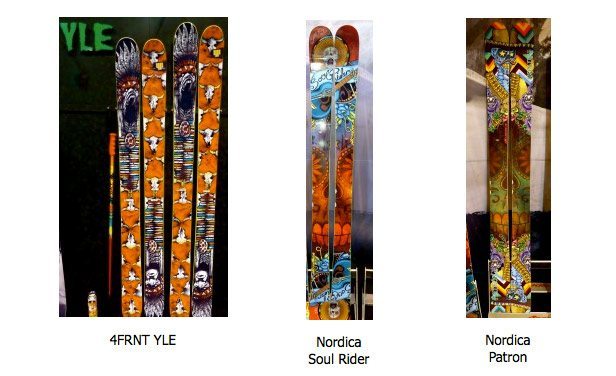
3-WAY TIE: 4FRNT YLE; NORDICA Soul Rider; NORDICA Patrón
Wait…did Nordica just place 2 skis in the top 3 for graphics??? I know, I’m shocked, too. But these graphics really POP (the full production run 4FRNT YLEs needs to pop a bit more to be perfect). Plus 4FNT’s YLE and these Nordicas have this sweet Southwest-theme thing going on, so they were clearly pandering to this judge’s sensibilities.
* BEST GRAPHICS ACROSS AN ENTIRE LINEUP:

4FRNT, for sure.
These guys are on it right now. And while we won’t steal their thunder and show you everything they’re set to unveil, the Renegade, EHP, and YLE are the standouts of the bunch.
Of course, it’s not as if stupid little graphics matter at all, it’s all about how the skis perform.
(Except that graphics do matter. A lot. Keep reading.)
* WORST GRAPHICS AWARD:
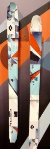
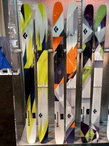
The whole Black Diamond geometry-themed lineup.
Dear Black Diamond,
This is an intervention, and we are intervening because we truly and deeply love you. You make phenomenal climbing gear. We are grateful for the Avalung, and in fact, we really like all of your avi gear. We even own three different pairs of BD ski poles, and we love each of them.
But your ski graphics are sort of awful. You’ve had this problem for a while now, and it’s time somebody said something – especially since we are really excited about three of your skis: the Amp, the Megawatt, and the Gigawatt. Of course, we won’t know anything until we test them, but they all have a smooth flex; they seem very solid, well constructed, and not overly heavy; and they are torsionally stiff. We think you might really have something here.
But man, those graphics….
We do, however, fully admit that graphics are of ZERO importance. If a ski is great, we wouldn’t care if it had a topsheet of a bunch of Teletubbies holding hands and dancing. (Actually, wait: that might be kind of awesome.)
But we also know that graphics do, in fact, drive ski sales. Whether we’re sitting on a lift, skinning up a mountain, or trying to muster up the courage to drop a sketchy line, skiers spend a lot of time staring at the their topsheets. We want to look down and see something sweet, something beautiful or badass. Something that resonates or inspires. And we know that you know this, and that you aren’t trying to make “meh” designs. We realize that lots of skis out there are ugly, but some of these are funky ugly, an exhibition of freedom and authenticity. They have soul. Graphics, I’m sure, are tricky, but they aren’t rocket science. Unfortunately, they aren’t geometry either.
And yes, this is all horribly subjective.
Anyway, we want to help. We should talk. We are rooting for you guys, and we think that you’ve got at least 3 skis that could warrant serious attention next season. In particular, the Amp enters a crowded and very competitive class of high performing, rockered, 115mm-ish waisted skis, and we still think it stands a good chance to impress.
Sincerely,
BLISTER
p.s. We have to admit: that Gigawatt graphic is kind of beginning to grow on us a bit….
* THE “THERE’S A 100% CHANCE BLISTER WILL DO A ‘VS.’ REVIEW ON THIS” AWARD
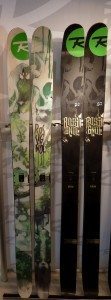
188cm ROSSIGNOL SUPER 7 VS. 188cm ROSSIGNOL S7
Rossignol’s S7 was one of the best selling skis of the past season. Now, the Super 7 – a burlier S7 with metal – is available in a shorter 188cm length, same as the S7, and this fact will have a lot of people wondering which ski to buy.
One thing that surprised me was that the Super 7 didn’t hand flex very stiff. And the S7 felt incredibly soft, almost noodly. I am not one to put much stock into hand flexing a ski, but I thought to myself that I couldn’t imagine purchasing the S7, that I would go Super 7 for sure.
But again, I don’t place much stock in a hand flex. So we will test both skis, pass them among our reviewers, and we’ll tell you what’s up.


OMG i was just rolling on the floor reading this!! That was totally awesome!!! I kept calling my son and daughter over to read this look at that. These are views I think we all must share because i couldn’t agree with any thing you said more!! WTF?
So its so obvious to pretty much anyone everything you said why don’t some of these big company’s get it????
EG i was at the ski shop today I wanted to fondle the Amp and megawatt. Like you say really sweet what they’re up to in shape and build, but graphics? The sales guy actually mentioned it before I said anything:] Also the Amp with a stiffer tail in a 195 PLEASE!! Well at least the last 10 inches of the tail that fold over unusually compared to the rest of the ski. But Love the ski a lot!!! Megawatt well Oh ya baby!! Even straight colors like DPS does would be sick? Imagine just an all white or Black top sheet with oposite color BD logo or combo of both with black bases off course in a 195 with a stiffer tail on the Amp!!!!!!!!!!!!!!!!!!!!!!!! for 699 !!
If I can figure this out why cant they? Anyway one of the best reads Ive had in a long time. i just found your site last month and make it the first stop for getting the straight goods!! Thanks for that. And oh ya. I hope you get to that Bodacious review soon!! Its on my list to add to my cant decide what to ski quiver. There is one unreal video on Youtube of a guy just killing it on these boards!! In the trees back flipping every were at Mach speeds threw crud and junk and awesomeness!! I sure would like to hear what you guys think of it.
Keep up the great reviews Blister Gear Reviews are awesome.
James
Thanks, James – glad you enjoyed it. Hard to believe that we’ll be back at SIA and producing the 2nd Annual BLISTER Awards in just TWO weeks!
Also, regarding the Bodacious, I’ve got good news: we’ll be getting out on them at the beginning of February, in a very, very cool location. Stay tuned….
Please please please tell me that Dynastar is going to win worst graphics award for the 2012 show. Me and a buddy literally started busting up laughing when we saw them.